Working with microdata
This class exercise practices using the tidyverse to manipulate datasets. Beginning from raw data, we will create the plots exploring trends of income inequality by education over time from class on Jan 30.
Download the RMarkdown file for this exercise to start working. Thanks to Abby Sachar for leading design of this exercise.
Overview of the steps we will cover
- Step 1: Prepare your working directory
- Step 2: Read the data into R
- Step 3: Get familiar with our dataset
- Step 4:
filter()to cases of interest - Step 5:
mutate()to create educational categories of interest - Step 6:
group_by()andsummarize()for subpopulation summaries - Step 7:
pivot_longer()to reshape data - Step 8:
left_join()to adjust for inflation - Step 9:
ggplot()to visualize - Conclusion
Step 1: Prepare your working directory
You’ve already downloaded a .dta file from IPUMS. If you haven’t, follow these instructions to do so. If for some reason you cannot access IPUMS, you can use our simulated data. But they aren’t as good—go get the one from IPUMS!
- Pick a folder on your computer to store your data, this .Rmd, and the output. This will be your working directory
- When .Rmd knits, it knows to look for the data wherever the .Rmd is saved
- To interact with the data from your R console more easily, set the working directory. Type
setwd("directory_on_your_computer")in your console and hit enter
Prepare R environment
Let’s first load packages at the top of our code file.
# loading relevant packages
library(tidyverse)
library(haven)
Step 2: Read the data into R
The data format .dta is the format used by Stata, but we can read it in R using the haven package (documentation). Use read_dta() and store the data in an object called micro.
micro <- read_dta("cps_00064.dta")
Step 3: Get familiar with our dataset
Why did we download as a .dta? .dta files are different from .csv files because they contain helpful information describing what each column contains and, for factor variables, which code matches to what category. This allows you to work with the dataset more easily without needing to continually return to the documentation.
To see the description of what each column contains, type View(micro) in the console. This will pop up another tab in RStudio which allows you to scroll through the dataset. You should see this description underneath each column header in the micro table tab.
To see which how codes match to categories, type head(micro) in the console. Look at the column educ. While the column contains values of type dbl, there is a label next to the number which reveals how that code translate to different educational categories. For example, the value 110 in row 2 in the educ column indicates that the person represented by row 2 had completed 4 years of college. There should be similar labels for the wkswork2 and age columns.
To see a full list of all of the labels for the column, you can print the column in the console. Type micro$educ into the console. The first part of the output shows the different dbl values contained in the column, but if you scroll down, you should see a list of all of the different values and the labels associated with it. This will be useful to us as we create our own educational categories of interest using the educ column.
Step 4: filter() to cases of interest
In this step, you will use filter() to convert your micro object to a new object called filtered.
Before we aggregate the microdata to year-level data, we filter so that the data will speak to our target population. In today’s exercise, we want to study annual wage and salary income among those who work at least 50 weeks in the year. This is a substantive choice.
We also filter to remove missing values, in this case on education and earnings. There are two main reasons data might be missing.
- Data can be missing for intentional reasons. For each variable, there is a universe of people to whom that variable applies. See how the universe for
incwageis listed in the IPUMS documentation. Often, the universe is the set of people for whom the question makes sense. For example, children do not have wage and salary incomes. For this reason, data about this variable are never available for those under age 14—they are always outside the universe. We substantively don’t want to study these people. Forincwage, they are codedincwage = 99999999(see codes). - Data can be missing for unintentional reasons. These are more concerning and less transparent. For instance,
incwage = 9999998indicates “Missing” with little explanation. We generally hope that opaque missingness is rare in our data.
To take another example, for the educ variable the values 0, 1, and 999 are values we will drop (documentation).
Using the filter() function, create an object called filtered which contains a filtered version of the micro dataset containing:
- only full-year workers (check labels of
wkswork2column to find which value matches to full-year workers) - wages which are greater than 0 and less than 99999998
- educational levels greater than 0 and less than 999
Check: filtered should have 1323760 rows and 6 columns.
filtered <- micro %>%
  # Subset to cases working full year
  filter(wkswork2 == 6) %>%
  # Subset to cases with valid income
  filter(incwage > 0 & incwage < 99999998) %>%
  # Subset to cases with valid education
  filter(educ > 1 & educ < 999)
Side note: Piping %>% for clean code
When you look at the filter() documentation (?dplyr::filter), the first argument is the data frame to be filtered. It could be used like this:
new_data <- filter(.data = old_data,
                   variable_1 == value_I_want)
The pipe operator %>% provides a new way to work with filter() and other tidyverse functions.
new_data <- old_data %>%
  filter(my_variable == value_I_want)
The operator %>% tells R to use old_data as the first argument in the filter() function. The pipe operators is terrific for strining together multiple lines of code in a readable way.
new_data <- old_data %>%
  filter(variable_1 == value_I_want_1) %>%
  filter(variable_2 == value_I_want_2) %>%
  filter(variable_3 == value_I_want_3)
For more info, see R4DS 5.6.1. We encourage you to use piping in this class exercise.
Step 5: mutate() to create educational categories of interest
In this step, you will use mutate() to convert your filtered object to a new object called mutated.
We want to group educational categories into two more broad categories: “College Degree” and “Less than College.” Look at the labels for educ to figure out which codes would fall into each group (documentation). Use the mutate() function to create a new variable education with these values.
- Tip: Use
case_when()within themutate()function to create both of the categories
mutated <- filtered %>%
  mutate(education = case_when(educ > 111 & educ < 999 ~ "College",
                               educ <= 111 ~ "Less than college"))
Step 6: group_by() and summarize() for subpopulation summaries
In this step, you will use group_by() and summarize() to convert your mutated object to a new object called summarized.
Our goal here is to convert microdata (on people) to year-level data (on the population).
- Use the
group_by()function to group byyearandeducation. This tells R that the next steps will be carried out within subpopulations defined by these variables - Use the
summarize()function to create 3 columns—p10, p50, and p90—which contain the income of the person at the 10th, 50th, and 90th percentiles respectively. Withinsummarize(), you will want to use thequantile()function to calculate these quantiles. - Note: We are not using the survey weight
asecwthere. We will add that in a future class
Check: the summarized data frame should have 120 rows and 5 columns (year, education categories, p10, p50, and p90).
summarized <- mutated %>%
  group_by(year, education) %>%
  summarize(p10 = quantile(x = incwage, 0.1),
            p50 = quantile(x = incwage, 0.5),
            p90 = quantile(x = incwage, 0.9),
            .groups = "drop")
Step 7: pivot_longer() to reshape data
In this step, you will use pivot_longer() to convert your summarized object to a new object called pivoted. We first explain why, then explain the task.
Why? For ggplot(), we want a single column for all of the -values to be plotted: the values of the 10th, 50th, and 90th percentiles. Currently, they are in 3 columns.
Here is the task. How our data look:
## # A tibble: 4 × 5
##    year education           p10   p50   p90
##   <dbl> <chr>             <dbl> <dbl> <dbl>
## 1  1962 College Degree     3900  7500 13500
## 2  1962 Less than College  1820  4900  8000
## 3  1964 College Degree     4000  7904 13510
## 4  1964 Less than College  2000  5200  8900
Here is how we want our data to look:
## # A tibble: 12 × 4
##     year education         quantity income
##    <dbl> <chr>             <chr>     <dbl>
##  1  1962 College Degree    p10        3900
##  2  1962 College Degree    p50        7500
##  3  1962 College Degree    p90       13500
##  4  1962 Less than College p10        1820
##  5  1962 Less than College p50        4900
##  6  1962 Less than College p90        8000
##  7  1964 College Degree    p10        4000
##  8  1964 College Degree    p50        7904
##  9  1964 College Degree    p90       13510
## 10  1964 Less than College p10        2000
## 11  1964 Less than College p50        5200
## 12  1964 Less than College p90        8900
Use pivot_longer to change the first data frame to the second.
- Use the
colsargument to tell it which columns will disappear - Use the
names_toargument to tell R that the names of those variables will be moved to a column calledquantity - Use the
values_toargument to tell R that the values of those variables will be moved to a column calledvalue
Check: the pivoted data frame should have
- 360 rows (60 years
2 education categories
- 4 columns (years, education categories, percentile values, and incomes)
pivoted <- summarized %>%
  pivot_longer(cols = c("p10","p50","p90"),
               names_to = "quantity",
               values_to = "value")
Step 8: left_join() to adjust for inflation
In this step, you will start with pivoted and then
- use
left_join()to append an inflation adjustment - use
mutate()to multiply income values from the previous step by theinflation_factor - use
select()to remove theinflation_factorvariable from the data
inflation <- read_csv("https://info3370.github.io/sp23/assets/data/inflation.csv")

joined <- pivoted %>%
  left_join(inflation,
            by = "year") %>%
  mutate(income = value * inflation_factor)
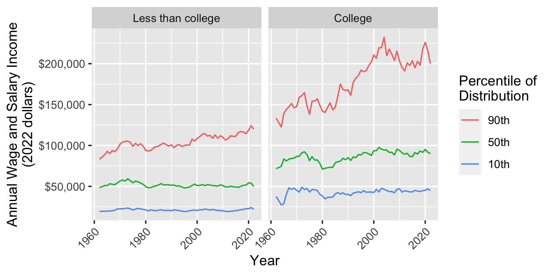
Step 9: ggplot() to visualize
Now make a ggplot() where
yearis on the-axis
incomeis on the-axis
quantityis denoted by coloreducationis placed on facets
joined %>%
  # Reverse order of quantity and education
  # for aesthetic reasons
  mutate(quantity = fct_rev(quantity),
         education = fct_rev(education)) %>%
  # Produce a ggplot
  ggplot(aes(x = year, y = income, color = quantity)) +
  geom_line() +
  facet_wrap(~education) +
  xlab("Year") +
  scale_y_continuous(name = "Annual Wage and Salary Income\n(2022 dollars)",
                     labels = scales::label_dollar()) +
  scale_color_discrete(name = "Percentile of\nDistribution",
                       labels = function(x) paste0(gsub("p","",x),"th")) +
  theme(axis.text.x = element_text(angle = 45, hjust = 1))
Conclusion
Before, we focused only on Step 9. But data analysis involves many steps! When analyzing data, steps like 1–8 take a large portion of your time. These steps are tedious, but also very important!
In the next exercise, we will learn how to create a custom function to use the asecwt to account for the CPS sample design and correctly weight the observations for population inference.